Canada 150 / Terry Fox Walk
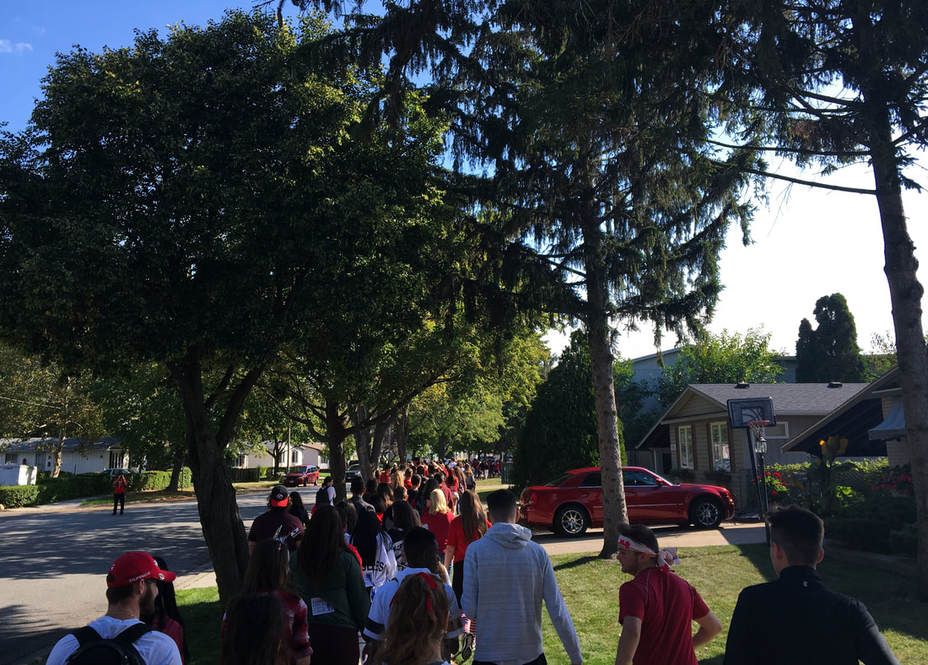
I chose this photo because it shows our school's unity and support for the Terry Fox Walk. The sea of red and white slowly trails off into the distance, and I like the contrast between the red and green. Red and green are complimentary colours on the colour wheel, making the contrast even higher. Even in the background the colours red and green are sprinkled everywhere. On the left side of the photo, the green hedges follow the curve of the road. On the street, somebody is sporting a red shirt taking photos, and further down there is a red minivan parked. On the right side of the photo, a red car is parked in the driveway and there are some red flowers planted near the house. All of this red combined with the green in the trees, grass and plants makes for an excellent contrast. To edit this photo, I brightened the red and green to add even more to the contrast. Next I rotated it so that the roof of the closest house was a horizontal line. Finally, I cropped out most of the sky to help balance the weight of the photo.
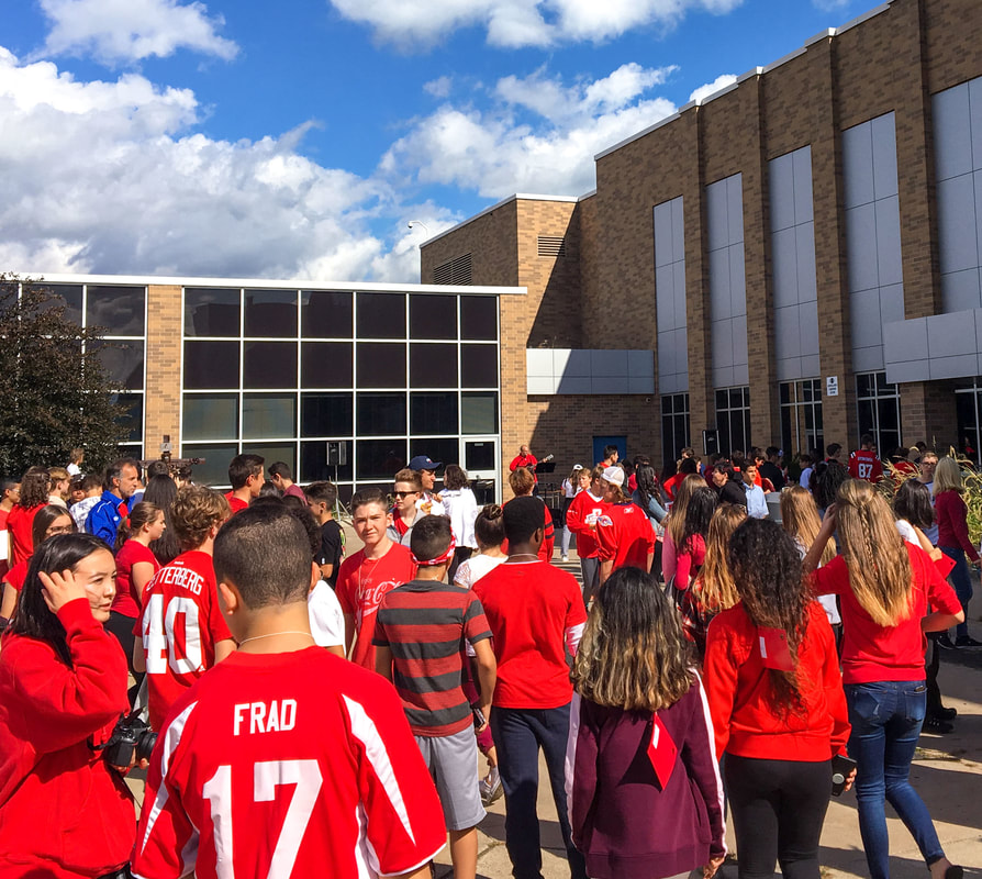
I especially like this photo due because you instantly notice the entire bottom half of the photo is vibrant red while the top half has no red at all. This contrast really draws me to this photo over any of the other ones I took. Just by looking at this relatively small group of people, you can see how much spirit our school has; nearly everyone is wearing red or white. To edit this, a few things had to be done. I first rotated the photo to align the back windows horizontally. I then cropped it to help balance the red and non-red areas of the photo. I then white balanced to ensure the whites stood out. Finally, I increased the saturation to help make the red pop out even more.
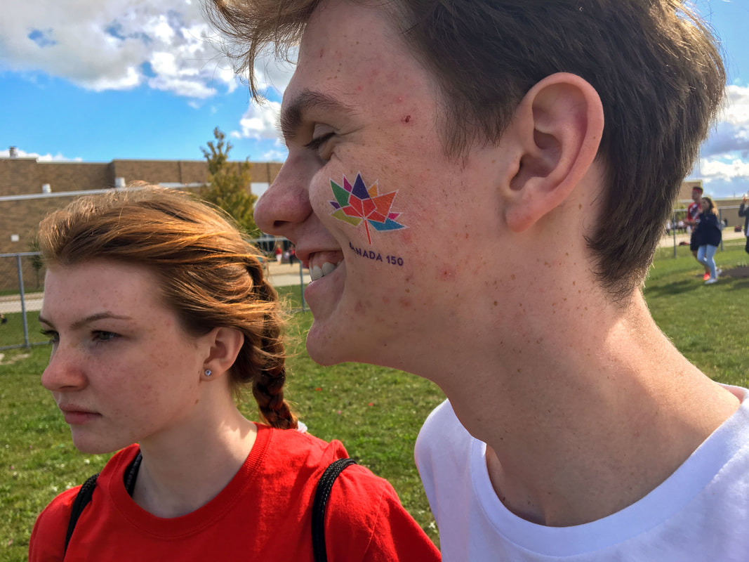
I chose this as my third photo because I love the way he is smiling. I believe it helps show the fun of the day and how relaxed it all was. These two are sporting the red and white colours as they watch the hockey game. I really like how the tattoo looks, adding some extra colour to his smile and face altogether. To edit this photo, I rotated it so that the top line of the school was horizontal. I then cropped out a little from the far left to bring the focus more towards the faces and lowered the brightness and shadows to help reduce any back-light. Finally, I tested out the teeth whitening by whitening his smile a little.
Thanksgiving
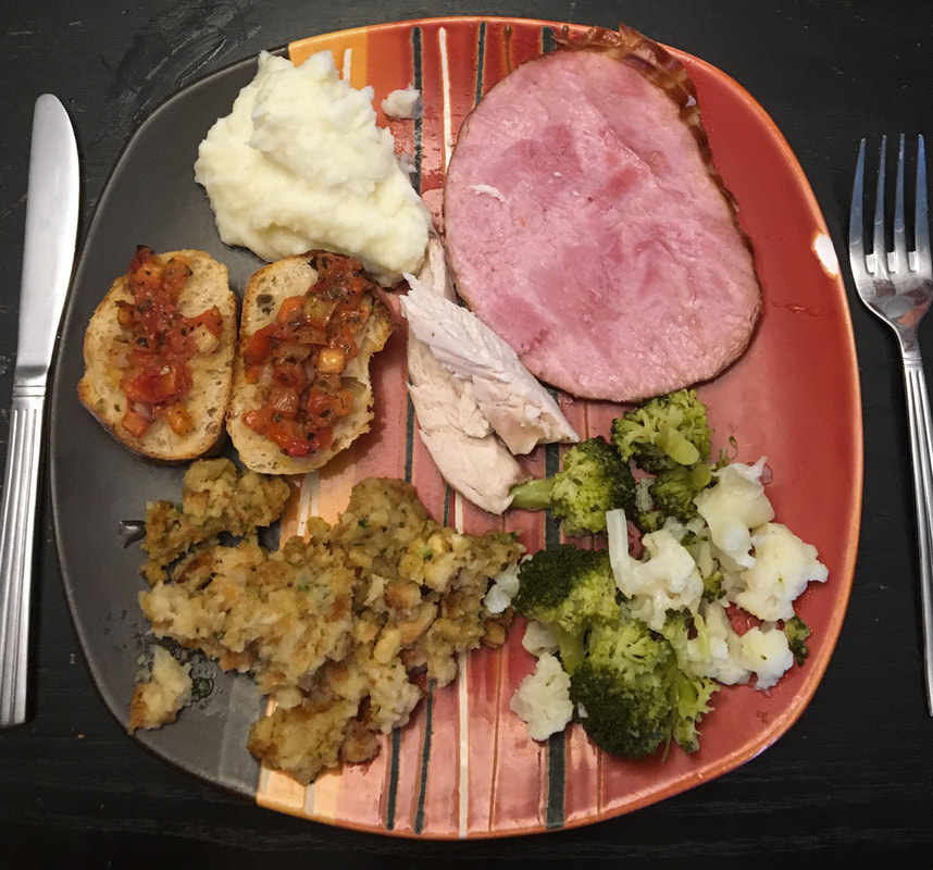
I liked this photo because it reminds me of Thanksgiving dinner with my family. There are varying colours to make the photo stand out. This photo makes me hungry. I made my plate as pretty as I could just for this photo. Took a full family effort. My mother was going to just order pizza but I told her I needed Thanksgiving photos, so she made a full thanksgiving meal. I like the way the food texture looks, and I like the circular plate to help keep the photo balanced. In order to edit, I just straightened it out, white balanced and added shadows.
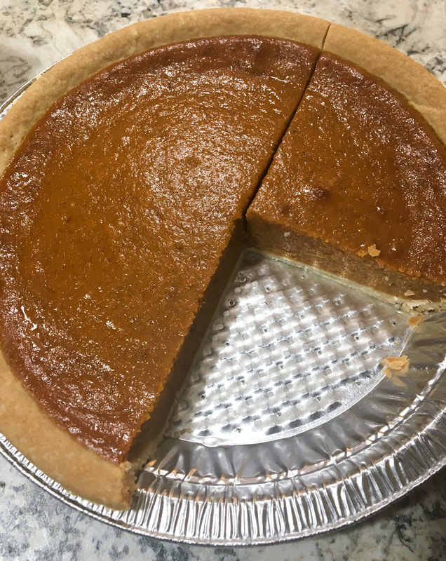
I decided on this photo because I believe it symbolizes what Thanksgiving is about. After dinner, me and my family always split a pumpkin pie. I liked the way light reflected off the pie in many different spots. The orange colour stands out and helps add to the thanksgiving theme. To edit, I simply cropped it to bring the pie into the middle, white balanced it, and then increased the saturation to brighten the colour.

I decided on this photo because my family didn't pose for any photos but my dog would. I'm very thankful for my family, and my little dog too. I liked the motion blur created by her tongue, as well as the dark window creating a contrast with her light coloured fur and the couch. You can clearly see the texture of the couch and fur. In lightroom, I white balanced first and decided not to crop since the photo was pretty tight already. I increased the highlights and the shadows, giving the whites a more dominant look.
Shadows
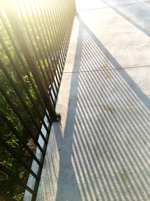
I chose this photo because I liked the pattern within the shadow. The perfect diagonal lines make for a very interesting photograph. I also enjoy the way the sunlight pokes through the fence in the top of the photo. To edit this, I wanted to make sure i didn’t change the way the light and shadows looked. I first who’re balanced and then cropped a little off of the top of the photo to better weight the photo. I increased the shadows to emphasize them, and darkened the blacks. This made the shadows pop a little bit more. I then lowered the highlights to lessen the backlighting provided by the sun. I brightened the whites to increase the contrast between the concrete floor and the shadows.
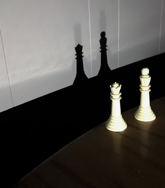
When taking this photo, I wanted to create interesting shadows by using an object with a unique shape. I went looking and found an old chess set. I used the king and queen, two pieces that had interesting silhouettes. I used a flashlight in a dark room to cast these shadows against the wall. I liked the way the white wall contrasted against the dark shadows. I intentionally chose this effect to emphasize the unique silhouettes and contrast. When editing, I wanted to further enhance the darkness of the shadows to contrast the wall. I first white balanced and cropped. I then turned up the shadows and the highlights to increase the white/black contrast.
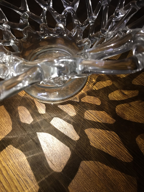
I knew right away I wanted to use the vase when we were assigned the shadows assignment because I knew it would provide a cool photo. It turned out better than what I had expected. My focus for editing was to make sure the shadows were a major focus of the photo. I worked on darkening the blacks by again increasing shadows and decreasing highlights as well as darkening blacks and brightening whites.
Autumn
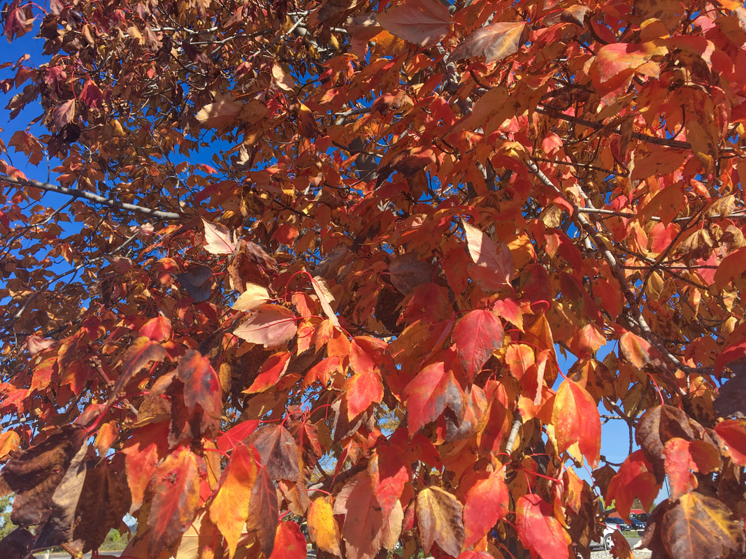
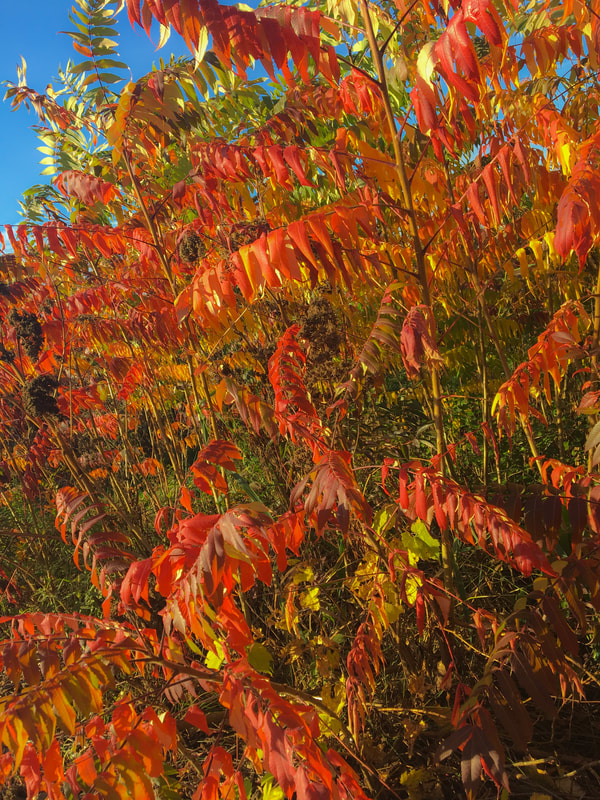
After my shift at work, I was waiting for my bus when I noticed a very nicely coloured tree down the road. I wanted to capture the changing colours of autumn, and this tree very nicely expressed all of the autumn colours. I also enjoy the way the sunlight naturally brightens the colours of the leaves. When editing this photo, I concentrated on the colours. I first white balanced and cropped a little bit off the bottom so that only the tree was in the picture. I then increased the vibrance ever so slightly so that the red and yellow popped. I decreased the highlights so that the sun wasn't blinding off the leaves. Lastly, I decreased the shadows a little to reduce some unnecessary darkness.
I really like this photo because off the variety of colours. To me, autumn is all about the pretty colours in the trees. In this photo there are a range of dark reds, reds, oranges, yellows, and a little bit of greens. The colour stands out and makes the photo intriguing to look at. When editing, I had to rotate the photo a little because it looked crooked. I then white balanced. I also turned up the saturation a tad to brighten the colours. I decreased the highlight from the top left corner because it was too bright. I finally increased the yellow tint to bring more overall colour to the picture.
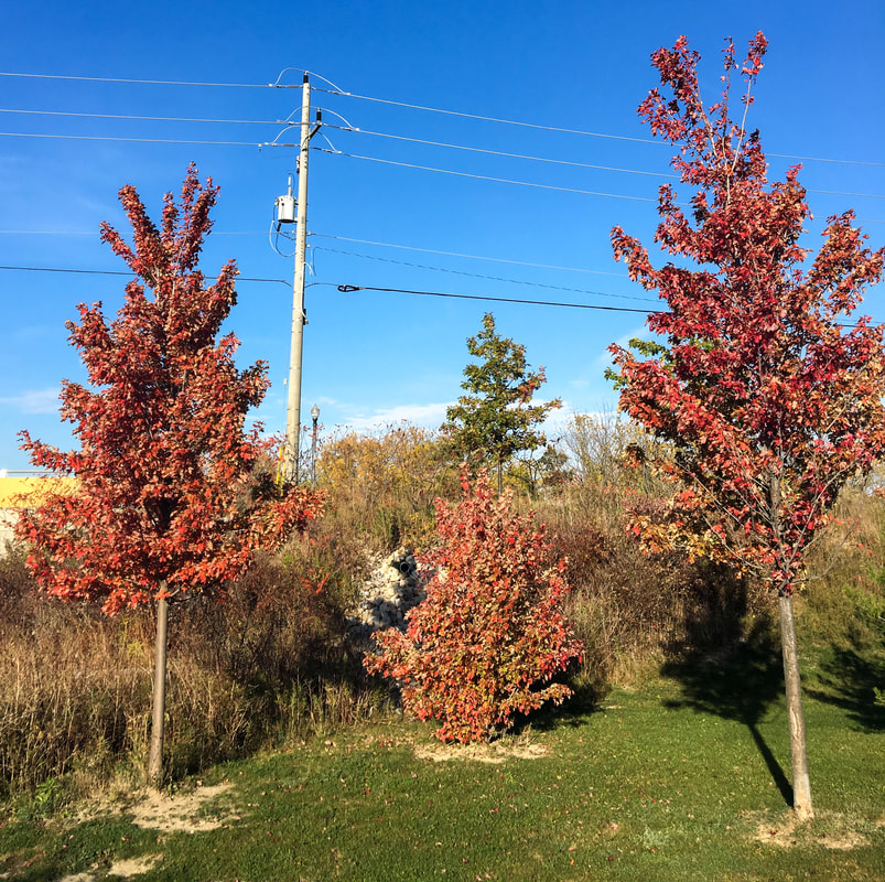
Once I saw these trees I knew I wanted a photo. I liked the symmetry this area had, with two taller trees on each side and a shorter one in the middle. It was weighted perfectly. When editing, i didn't do much. I white balanced and cropped a little off of the left side to help weight it better. I then increased the blacks to bring out the shadows a little more. Next, I decreased the highlight in the sky because it was a little too much. Finally, I increased the contrast which made the red trees stand out against the green grass and blue sky.
Halloween
I liked this photo because it both captured the halloween orange colours as well as the halloween candy. I also like how the background is in focus and the foreground is slightly blurred. It draws all focus into the photo rather than away from it. When editing, I increased the clarity which gave it a spooky look. I also decreased the highlight to reduce the glare. I increased shadow to add to the darkened, halloween vibes. I increased the whites to make all the whites true white, and proceeded to do all the blacks. I finished up by rotating it a little bit to assist in weighting the photo.
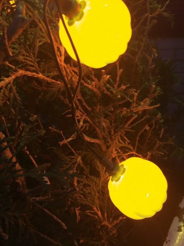
I selected this picture because of the dim yellowish light provided by the pumpkin lights. It gives the green bush a more brown and dead look, also adding to the halloween theme. To edit this, I decreased the highlight on the lights and increased the shadow of the bush to increase the light/dark contrast. I then played around with the saturation, tint, and tone to try and make the pumpkins more orange but it either made them look very fake and over-edited or made it even more yellow. I ended up with this result, and it was the best I could get. I wish it was a little more orange, but hey. I finalized the edits by rotating the picture to better weight it.
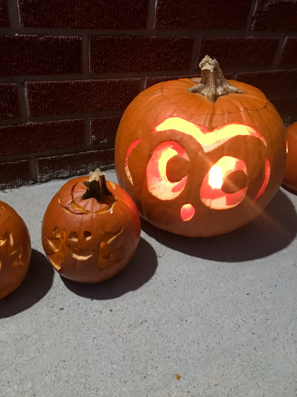
Of course I needed at least one photo of pumpkins because it's halloween. I liked this one the best because to me it best represents halloween. I like how the brick in the background contrast the grey cement porch. That draws your focus towards the pumpkins and the light glowing from them. The shadows from the jack-o-lanterns add to the effect. To edit, I darkened the pictures by increasing the shadows and decreasing highlight. I then increased the highlight of the eyes, nose and mouth of each lantern. I played with the saturation and contrast but ultimately went against those changes. I finished the editing by selecting the brick background and decreasing the saturation a little to take away from the red colour and help avoid the bricks drawing attention away from the center focus.
Shoes